Mobile Website Design – Web Design in a New Way
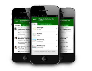
It’s imperative that web designers and developers learn optimal development and design practices for mobile devices. Not everything shown on a PC site can fit reasonably onto a mobile web page, where space is short and every pixel counts. It’s important to reduce the amount of content shown on the mobile-optimized version. You will need to look at mobile website design in a new way, one that is decidedly more restrictive than designed for standard browsers. To work around the issues that mobile site design presents, and to get a result that is as user-friendly and useful as your standard site, some creative problem-solving skills are required.
Though many of these screens can comfortably display a standard website certain devices require specially designed site of a smaller size as you want your site is at least usable on the majority of mobile platforms.
-
- Reduce the amount of content: mobile websites should be much focused. Only include the most important content and feature and any low priority content or link that are outside the main content should be removed.
- Single column layout: wide web page is difficult to view on small screens. On relatively larger screens also the text appears zoomed out and is not user friendly. Instead single column that expands downwards is the best choice as the text would be readable and scrolling down is easy in most phones.
- Present the navigation differently: Place the navigation of the site in accordance to the purpose of the site. If it’s an ecommerce site the content can be pushed down or be shifted to other pages, if content is important navigation can be placed at the bottom of the page or even in drop down boxes.
- Minimise text entry: Typing text in a mobile device is not as easy as typing on a pc keyboard. Your mobile website design should have features to store already entered data of address, pin code etc in “my account”. Product suggestion so that the user does not have to type much.
- Decide if one website is enough: Cell phone and mobile device platforms vary greatly when it comes to operating system, screen size, resolution, and user interface. Smart phone have a fast download speed as compared to the less advanced phones which might crash upon trying to download heavier sites. To cater to both the categories you might need more than one type of mobile website design.
- Design for touch screen and non-touch screen phones: if links are placed too close then it’s more likely possible to tap the wrong or undesired link, as the thickness of fingers is more to tap very small links. Considering this use thick rows than span the width of the screen or square boxes can both of which can be tapped easily.
- Use the inbuilt functionalities: provide the users an option to ring directly when they tap on the phone number. You can link the site to maps, so it becomes easy to locate the place. Nearest store location can be shown using maps or GPS.
You need to consider your site visitors’ most common screen size and resolution. Your mobile website design should work on the widest range of mobile devices that your visitors might be using. Look for ways to simplify both the design and functionality of your site. This might mean redoing your menus, eliminating images. Eliminating graphic elements from your site is usually an effective way to optimize its display on a mobile device.
Your mobile site, in most cases, should be simpler than your standard site.


