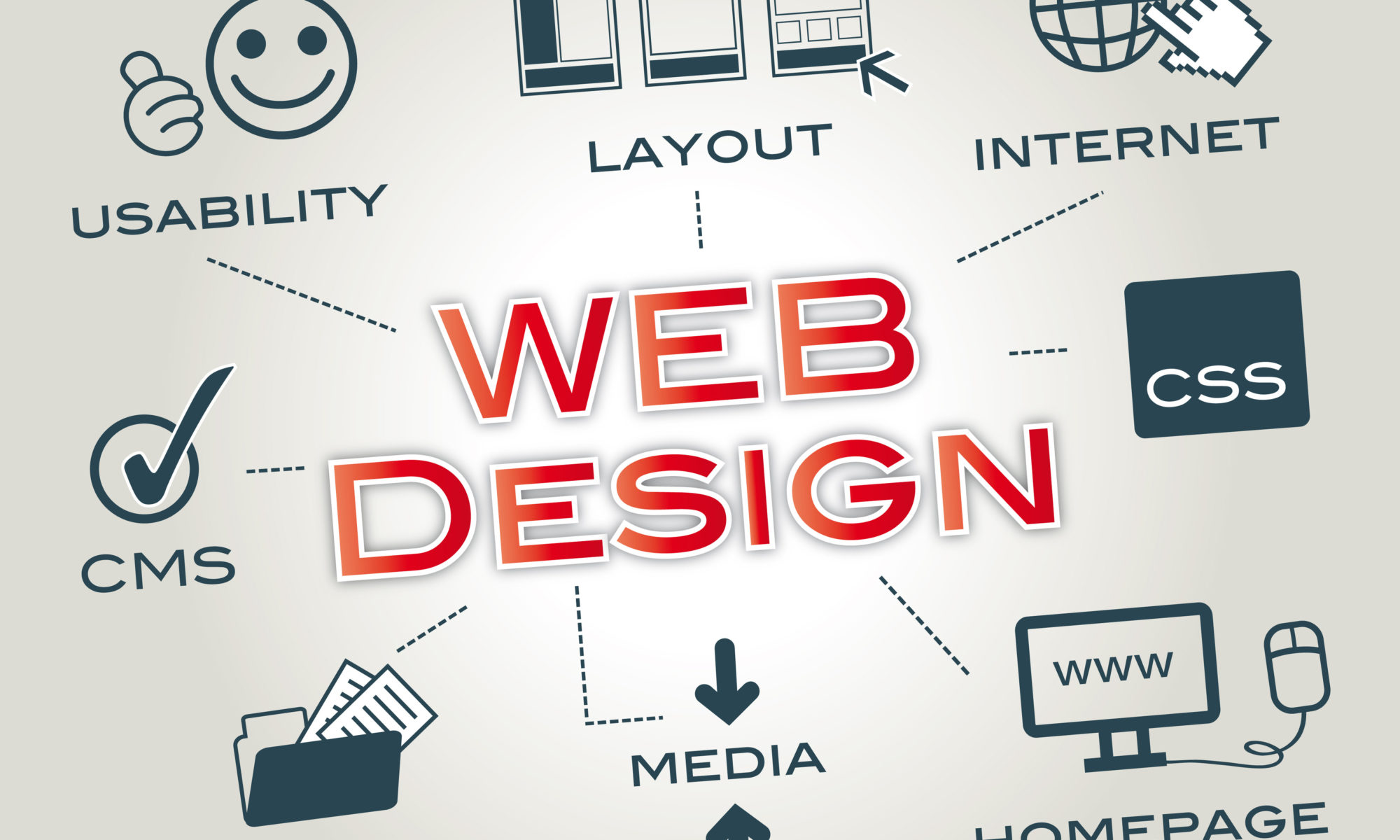
Top 4 Common Mistakes to Avoid While Designing a Website
A well-designed website helps a business in several ways. It helps you convey your message in a professional manner, helps users navigate through the website, engages prospects, and even accelerates the conversion rate. However, common design errors will not allow you to enjoy these benefits and even derail the purpose of having a website, i.e., engage your customers. So, if you want to leverage the benefits of a well-designed website you can contact a top web design company in UK such as Nhance Digital.
To provide you with an edge in the competitive online space, we have pointed out some of the common website design mistakes that must be avoided when designing one for yourself.
Website Design Mistakes that You Must Avoid
1. Long loading time
If your website takes a long time to load then it can be triggered by design errors and must be resolved as soon as possible. This is because there are millions of websites out there offering similar services and customers are looking for an enhanced user experience. Thus, a slow loading website hurts the user experience, which, in turn, can hurt its rankings on Google.
Improperly optimised images, and hefty themes, are some of the reasons that make a website slow. Thus, for the best website design services, you must always hire the best web design company in UK.
2. Poor layout
If a website lacks in areas such as adequate white space, a simple navigation framework, carefully placed call to action buttons, etc. then it has a poor layout. Such websites will never attract visitors, let alone boost retention and conversion rates. Your website design must be functional if you want your customers to perform specific tasks such as subscribing to newsletters, purchasing an item or availing of a service.
3. Not mobile-friendly
In case your website is not mobile-friendly, which means that it is not responsive and fails to scale down to smaller screens, your business will be missing out on a lot of traffic. Today, a majority of users use smartphones to visit their favourite websites, so if your website fails to align to these smaller screens properly, it will turn away visitors as they will not find your website useful.
4. No Call to Action
Even if your website is receiving a lot of traffic and yet you are not achieving your goals, such as securing subscribers or converting visitors, the problem might be with poor implementation of the Call to Action button. A top web design company in London recommends strategically placing the CTA button across the website can help you to achieve a better conversion rate.
When designing a website it is essential to focus on several aspects. Launching a poorly designed website simply means a waste of time, effort and financial loss. Thus, if you want to make a mark in this crowded digital market, you must know what design mistakes can cost you immensely. For avoiding such mistakes you can hire a reputable web design company in London say Nhance Digital for dignified solutions.


